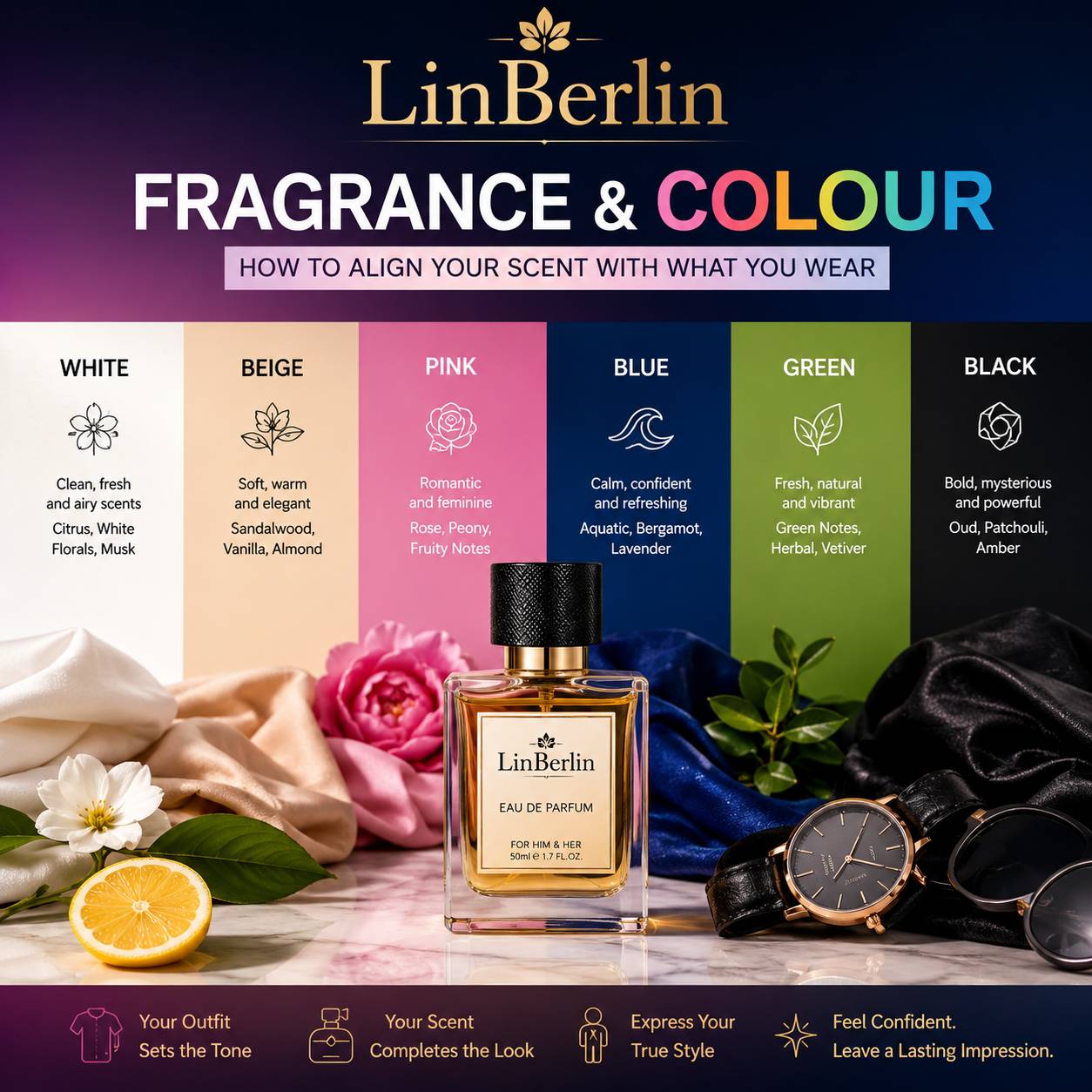
There's a moment every stylist knows and most perfume shoppers never think about: the second you spray a scent and then get dressed, the fabric starts editing the fragrance without asking your permission. Wool softens it. Silk barely holds it. Linen lets it evaporate faster than you'd like. And colour — this is the part people miss — colour changes how a scent is read, even though colour has no chemistry to speak of. It's psychological. But it's real, and it shapes how attar or perfume gets perceived on you long before anyone gets close enough to actually smell it.
So this isn't a listicle about pairing "fresh" scents with "bright" clothes and calling it done. It's about something closer to how a stylist actually thinks — texture, undertone, mood, occasion — and how attar, being oil-based and skin-anchored rather than alcohol-sprayed into the air, behaves differently against each of these than a conventional perfume would.
Why colour and scent are more connected than they should be
Colour theory says warm tones (rust, mustard, terracotta) read as grounded and energetic, while cool tones (slate, ice blue, sage) read as calm and controlled. Fragrance families carry almost identical emotional weight — ambers and ouds feel warm and grounded, while citrus and green notes feel cool and controlled. Wear a rust-coloured kurta with a light citrus attar and something feels slightly off, even if neither element is wrong on its own. The eye expects one mood; the nose delivers another.
This isn't superstition. It's the same reason a black-tie event never gets a beach-holiday soundtrack — context sets an expectation, and clashing it, even subtly, registers as dissonance before anyone can articulate why.
Neutrals: where attar actually gets to shine
Beige, ivory, sand, taupe — these give a fragrance room to be the main character instead of competing with a loud print or a saturated colour. On neutral fabric, a rounder, more textured attar (sandalwood, oud, amber) reads as intentional rather than heavy. This is also where skin becomes the real variable, more than the outfit does.
Dry skin holds onto oil-based attar noticeably less well than well-moisturised skin — the scent molecules need something to bind to, and dry skin simply doesn't offer much surface for that. Realistically, if you're wearing a neutral outfit and want an attar's woody base to actually last through the afternoon, apply it right after a shower on slightly damp skin, ideally over a fragrance-free moisturiser. Skip the moisturiser and the same oil that would've lasted six hours might fade in two — the outfit stays perfect, the scent just isn't there anymore to match it.
If you're leaning into a sandalwood-forward attar for this kind of neutral, understated look, it's genuinely worth knowing what you're buying — a lot of what's sold as sandalwood today is diluted or entirely synthetic, and learning to identify a genuine sandalwood aroma will save you from wasting money on something that smells right in the bottle and wrong on skin.
Earth tones and warm neutrals: rust, mustard, terracotta
These colours want depth. Oud, saffron-laced attars, spiced amber — all of it sits comfortably here because the fragrance and the palette are telling the same story: grounded, rich, a little dramatic. But — and this is where people overcorrect — too much depth on top of too much depth can tip into heaviness. A single strong note (oud alone, or amber alone) usually reads better against earth tones than a fragrance stacking three or four heavy accords at once.
One honest caveat here: heavier attars are also the ones most likely to feel overwhelming in humid weather or enclosed spaces, so if you're wearing mustard or rust to something indoors and air-conditioned, one or two dabs is genuinely enough. More isn't more; it's just more.
Cool tones: blues, greys, sage, ice pastels
Or think of it the opposite way — cool colours want restraint, not richness. Aquatic, green, or lightly floral attars complement these palettes without fighting them. Lavender is particularly underrated here. It reads as composed rather than sweet, which suits grey and slate tones almost perfectly, and it layers beautifully with something warmer underneath if you want a bit of contrast rather than a flat match. Lavender's calming character paired against vanilla's warmth is one combination worth knowing, because it lets you dial a cool-toned outfit warmer or cooler depending on how much of each you apply.
Oily or combination skin, incidentally, tends to hold lighter florals and aquatics longer than dry skin does — the natural sebum acts almost like a fixative. So if your skin runs oily, cool-palette days are actually where you'll get the most consistent performance out of a lighter attar.
Black: the trickiest one, honestly
Black absorbs attention rather than reflecting it, so it can carry almost anything — oud, leather-adjacent notes, dark amber, even a sharp spice. The risk with black isn't a wrong pairing; it's over-application, because dark fabric doesn't visually "show" a heavy scent the way pale fabric might hint at a heavy look. People tend to apply more attar with black clothing without realising it, purely because there's no visual feedback telling them to stop.
White and pastels: proceed carefully
Light fabric shows oil. It's — well, it's more complicated than just "avoid dark attars," because the actual risk depends on where you apply it, not just which attar you choose. A concentrated oud or amber attar applied directly onto white linen, rather than onto pulse points on skin, can leave a faint mark that sets over time. The safer habit: apply to skin (wrists, inner elbow, behind ears, base of neck) and let the fabric pick up scent naturally through proximity, rather than dabbing attar straight onto the garment itself.
Lighter florals, citrus-forward blends, and soft musks genuinely suit white and pastel outfits best, both aesthetically and practically, since they're less likely to stain even if a drop does land on fabric.
Matching scent to season as much as to colour
Colour and season are rarely separate decisions — pastels cluster in spring, jewel tones in autumn, whites through summer — and fragrance intensity should shift right along with them. A rich oud that feels perfect against a winter charcoal coat can feel almost aggressive against a summer white kurta in 38-degree heat, not because the attar changed, but because heat amplifies projection and humidity holds scent closer to skin for longer. If this is a pattern you find yourself navigating every few months, a season-by-season approach to matching perfume and outfit is worth working through properly rather than guessing each time the weather turns.
Building toward a wardrobe of scent profiles, not just one bottle
Here's the thing most people get wrong when they buy attar: they buy one bottle and expect it to do every job — office, wedding, casual weekend, evening out. It won't, not well anyway. A more realistic approach is thinking in profiles: something warm and grounded for earth tones and evening wear, something lighter and cleaner for whites and pastels, something spiced for festive colour, something restrained for cool-toned formal days. A small set of core scent profiles built around what's already in your wardrobe ends up being more useful, long term, than any single "signature" scent could be on its own.
And that ties into something bigger than colour-matching for any one outfit. What you consistently reach for — the warm-toned bottle you grab for rust and mustard, the lighter one for whites — starts to become how people recognise you before they even see your face. If you're at the point of narrowing things down rather than experimenting endlessly, it's worth thinking about choosing a signature scent that actually represents your personal style rather than whatever's trending that season.
A note on skin, sensitivity, and when to hold back
None of this matters much if the attar irritates your skin before it ever gets the chance to complement an outfit. A few things genuinely worth flagging: if you're using retinoids, exfoliating acids, or any strong actives in your skincare routine, apply attar to a spot well away from where those actives sit — layering concentrated oil directly over compromised or actively-exfoliating skin barrier is one of the more common ways people end up with unexpected redness or a burning sensation, and it usually has nothing to do with the fragrance itself being "bad" for them. Pregnant readers, and anyone with a history of skin allergies, should patch-test any new attar on the inner forearm and wait 24 hours before applying it anywhere near the neck or face. This is standard advice, but it's the kind of standard advice people skip because attar feels natural and therefore harmless — it isn't automatically either.
If you notice a scent that used to sit well on your skin suddenly causing irritation, that's often less about the attar changing and more about a new skincare product interacting with it. Worth checking before assuming the fragrance itself is at fault.
Where this actually leaves you
Matching scent to colour isn't a formula, and treating it like one misses the point. It's closer to a habit — noticing what a rust kurta wants versus what a white one wants, noticing how your own skin holds onto scent differently depending on the season or your skincare routine that week. Start with one or two attars that cover your most-worn colour categories, pay attention to how they behave on your particular skin, and build outward from there. The outfit and the fragrance were never really two separate decisions to begin with.